
What is a Japanese Candlestick?
While we briefly covered candlestick charting analysis in the previous lesson, we'll now dig in a little and discuss them more in detail. Let's do a quick review first.

What is Candlestick Trading?
Back in the day when Godzilla was still a cute little lizard, the Japanese created their own old school version of technical analysis to trade rice. That's right, rice.
A westerner by the name of Steve Nison "discovered" this secret technique called "Japanese candlesticks", learning it from a fellow Japanese broker. Steve researched, studied, lived, breathed, ate candlesticks, and began to write about it. Slowly, this secret technique grew in popularity in the 90s. To make a long story short, without Steve Nison, candlestick charts might have remained a buried secret.
Candlesticks can be used for any time frame, whether it be one day, one hour, 30-minutes - whatever you want! Candlesticks are used to describe the price action during the given time frame.
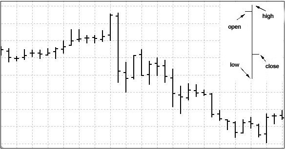
Candlesticks are formed using the open, high, low, and close of the chosen time period.
• If the close is above the open, then a hollow candlestick (usually displayed as Green) is drawn.
• If the close is below the open, then a filled candlestick (usually displayed as Red) is drawn.
• The hollow or filled section of the candlestick is called the "real body" or body.
• The thin lines poking above and below the body display the high/low range and are called shadows.
• The top of the upper shadow is the "high".
• The bottom of the lower shadow is the "low".
While we briefly covered candlestick charting analysis in the previous lesson, we'll now dig in a little and discuss them more in detail. Let's do a quick review first.

What is Candlestick Trading?
Back in the day when Godzilla was still a cute little lizard, the Japanese created their own old school version of technical analysis to trade rice. That's right, rice.
A westerner by the name of Steve Nison "discovered" this secret technique called "Japanese candlesticks", learning it from a fellow Japanese broker. Steve researched, studied, lived, breathed, ate candlesticks, and began to write about it. Slowly, this secret technique grew in popularity in the 90s. To make a long story short, without Steve Nison, candlestick charts might have remained a buried secret.
Candlesticks can be used for any time frame, whether it be one day, one hour, 30-minutes - whatever you want! Candlesticks are used to describe the price action during the given time frame.
Candlesticks are formed using the open, high, low, and close of the chosen time period.
• If the close is above the open, then a hollow candlestick (usually displayed as Green) is drawn.
• If the close is below the open, then a filled candlestick (usually displayed as Red) is drawn.
• The hollow or filled section of the candlestick is called the "real body" or body.
• The thin lines poking above and below the body display the high/low range and are called shadows.
• The top of the upper shadow is the "high".
• The bottom of the lower shadow is the "low".